
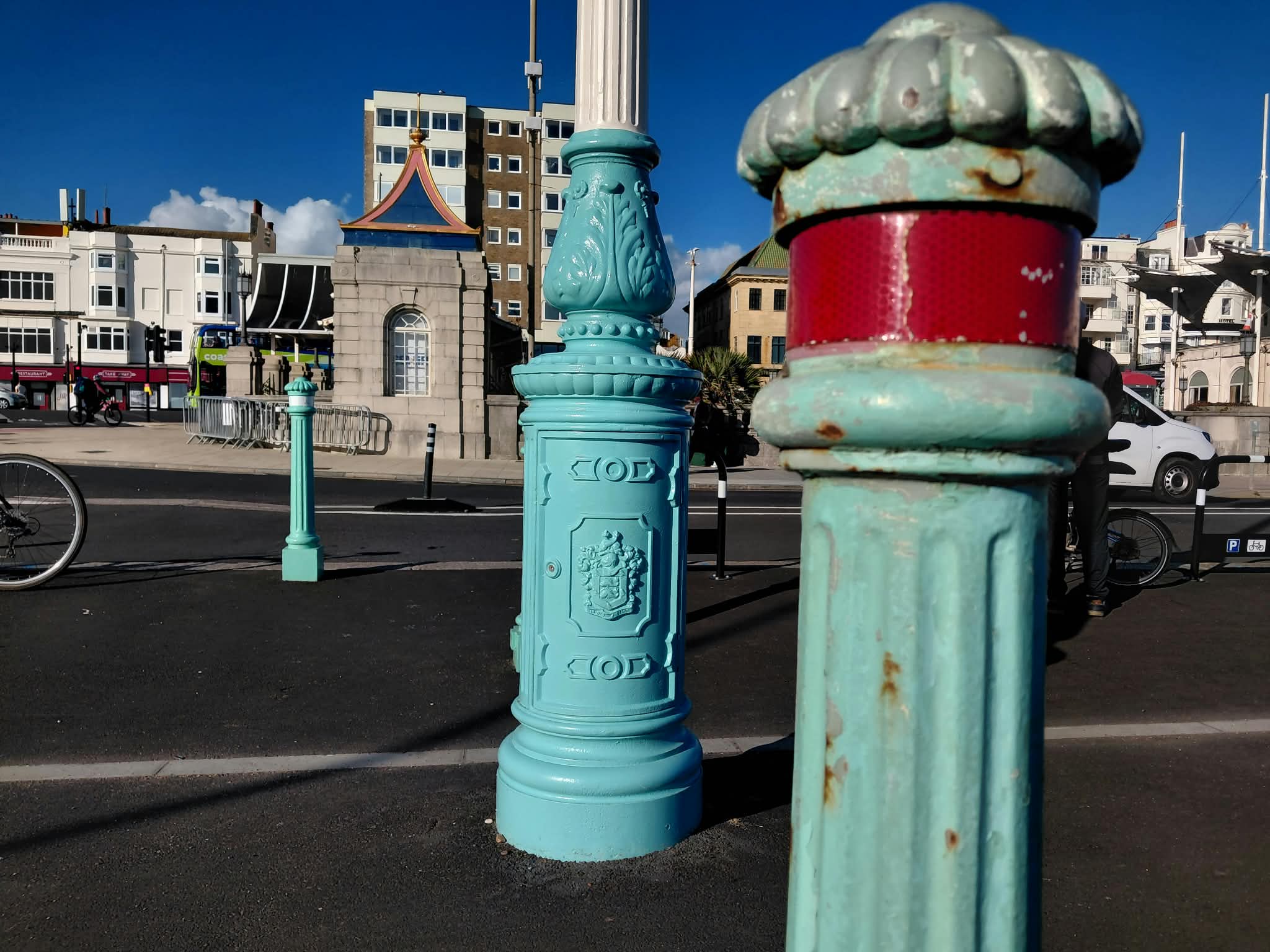
The distinctive shade of aqua known as Brighton Blue is not being used for restored seafront terraces or lamp columns because it costs too much.
Getting specialist protective paint mixed to precisely the right shade can add tens of thousands to paint budgets.
Brighton and Hove City Council has decided instead to opt for the closest match to the pale turquoise from the range of standard colours, known as RAL colours – which is known as 6027 or light green.
At an update meeting for the Madeira Terrace project two weeks ago, council project manager Abigail Hone said: “RAL colour is cheaper. The paint will be used for seafront fixtures going forward too.”
She then said she was not 100% certain what was being used for all seafront fixtures.
Brighton and Hove City Council’s press office subsequently said Brighton Blue was “made obsolete” pre-2012 and that the council is moving away from using oil-based paints on heritage cast iron.
However, freshly painted bollards by the Palace Pier have been painted in a colour which more closely matches Brighton Blue, and is visibly different to the RAL light green colour used on the restored lamp columns.
When put next to each other, RAL light green appears more blue than Brighton Blue.
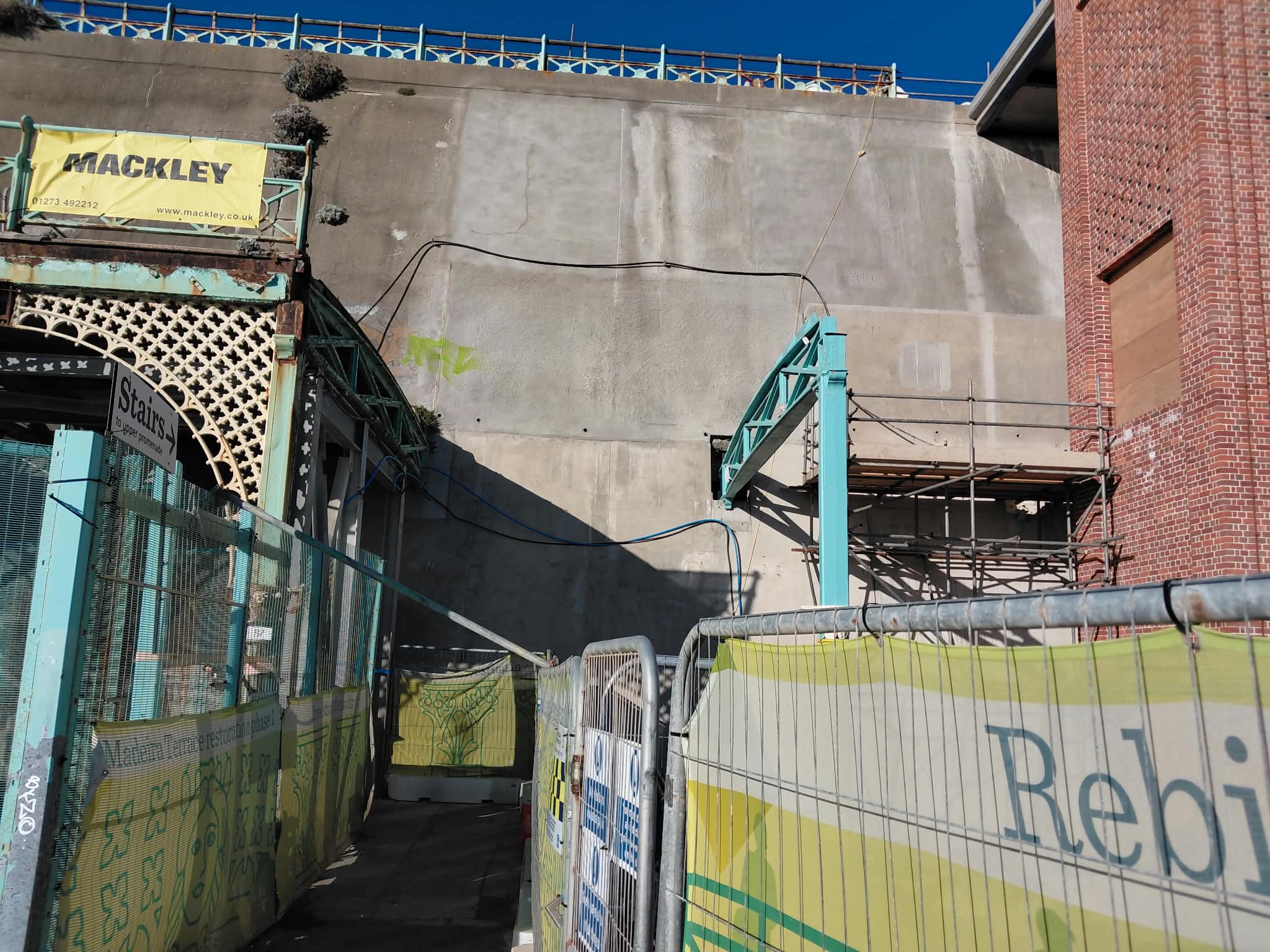
Contractor JT Mackley’s manager Mike Clegg, who has been overseeing the terrace restoration, told the meeting: “When we were stripping all the paint off the cast iron pieces, we discovered the original colour was a dark green.”
After the meeting, cabinet member for public realm Jacob Allen said: “To protect the cast ironwork, we’re using a specialist long-lasting coating system, rather than standard paint, and the closest available match to the turquoise paint used on the terrace since the 1920s as determined by microscopic paint analysis.
“The use of the matched colour is specific to restoration projects, such as Madeira Terrace and the city’s seafront lamp columns, where durability and long-term maintenance are important considerations.
“In daylight, it will very closely match the turquoise used on the terrace for the past 100 years, while the terrace’s new lighting scheme will create different visual effects after dark.
“Over time the appearance of the colours will become more muted but we are confident this is as good a match as possible.”





Brighton Blue paint has probably been made obsolete for such a long time as the Council hasn’t bought any! I’m not that bothered about the difference though, anything is better than the horrible rust.
This must mean that nothing on the seafront has been maintained in this colour since 2012!
The colour is pretty unique to Brighton and part of the city’s heritage – it’s been used for 100 years, and its use continued during financial crises and pressures in the past, including the the Great Depression in the 1930s, the Second World War, the Winter of Discontent. But this Labour council are ending it – the new colour is much more generic and clearly very different to the Brighton Blue which sets our seafront apart and is part of its character.
Just do it, no one will care, except those who bemoan any change just for the sake of moaning, not because it’s actually the hill they will die upon…
If you’d like to pay the difference Joe J, crack on. As it’s tax payers money, I think a stock colour is absolutely the correct and logical way to go.
Because Brighton and Hove City Council spend money so wisely .
No, it isn’t different at all. I challenge you to being tested to identify the difference
Also, you may want to specify exactly the shade of ‘Brighton Blue’ you think is so special:
a ) Fresh paint
b) UV faded five years
c) UV faded 25 years, or
d) UV faded back to your landmark one hundred years?
There is no single point of reference
Dose that mean the residents of recency square don’t have to pay for expensive Brunswick magnolia every few years in the same context…
All of the turquoise colours Brighton blue or otherwise are not original. When originally constructed by our descendants they were painted dark green which is what they should be now. The turquoise whatever RAL or otherwise is not correct and very distasteful.
You are either loyal to the history or not. The street lamps in many places are the height of bad taste, again should be replicas of the originals.
As long as it looks smart and blueish, that will do it for me.
The previous colour was related more to the sea. Couldn’t they have got a better match.
Yet, Quelle surprise, no shortage of money for underused and unenforceable cycle lanes?
it seems this Labour administration is on a scorched earth mission to destroy everything that makes Brighton and Hove special. Roll on the May 2027 local elections.
🤣
Hahah, undersused, are you having a laugh?
One learns that Brighton Blue is no longer to be Brighton Blue, but RAL 6027, a perfectly serviceable standard colour which is apparently cheaper and more durable.
How very practical.
What next? Harrods green replaced by whatever is nearest on the RAL chart? Cadbury purple deemed unnecessarily specific? Ferrari advised that red is red?
Perhaps the Royal Pavilion could simply be done in magnolia while we are at it. One understands there are some excellent bulk discounts.
Some colours are simply colours. Others are part of an identity.
Brighton Blue rather gave the game away.
Well said Lady Bracknell. Added to which – if they cannot afford the correct bespoke paint colour for our iconic seafront street furniture are they even using marine quality paint to last up to 15 years?
If they are skimping on the iconic colour, as sure as eggs is eggs, they will be buying cheap and unsuitable paint for the job. Or even watering it down. When, oh when, are we getting a certified City Clerk of Works to stop contractors making it up and fudging things as they go along and wasting public money?
“Buy cheap, buy twice” as I am sure you will remember the old saying.
Trace never knowingly misses an opportunity to whine.
Gabe never knowingly misses an opportunity to whine about others while failing to contribute anything intelligent to a thread.
Tracy, “buy cheap, buy twice” is indeed an expression with which one is painfully familiar.
I would perhaps reserve judgment on the quality of the paint until we know precisely what has been specified. One should never allow a perfectly good question to be weakened by an assumption that may prove unnecessary.
But your underlying question is surely entirely reasonable: what coating has been specified, what lifespan is expected, and how does its whole-life cost compare with the alternatives?
And do keep asking questions, my dear. Contrary to the occasional contribution below the line, asking how public money is being spent is not “whining”.
Disagree with the argument by all means. Being unpleasant about the person making it is rather less impressive.
Augusta
Probably good idea that B & H have a few quid saved in the coffers. They will need it when the city of sanctuary is visited by a few hundred illegal immigrants
Hopefully they’ll evict you to make way.
Stunning saving considering ,or have we forgotten?
The cost of £4,000,000 to recast the 80 lamp posts to original Victorian specification 😂
We’ve only had five double lanterns back so far and unpainted. Where are all the others? 163 was the original number. Ms Sankey has a lot of work left to do.
The cynic in me sees it as no surprise that “blue” is dropped in favour of something more akin to “green”.
Still… mustn’t grumble.
Before Brighton Blue the ironwork was dark green. That sounds like a beautiful colour to go back to.
Keep Brighton blue, it is our heritage colour, not be be lightly discarded.
With colour tech as it stands now it should be cheaper than years ago to get the colour mix not more expensive, unless you want supermarket standards. As a Quantity Surveyor getting alternatives prices should not be difficult to get the heritage colour vs RAL. Thousands extra is plain nonsense designed to shut down proper appraisal.
Is Cllr Allen (or his Council official script minder) ever able to produce a statement which is anything other than an appalling word soup? This is not communication – just rank obfuscation.
He should read Orwell’s ‘Politics and the English Language’.
Having enjoyed the colourful comments, one has now made the mistake of looking into this rather more closely.
And I find myself with a rather more serious question: who, precisely, decided that Brighton is ditching Brighton Blue?
This is not merely a tin of paint. Brighton Blue has become part of the visual language of our Victorian seafront, with the council’s own contractors previously describing their bespoke Brighton Blue as colour-matching a 19th-century design.
The council itself specified “Brighton Blue” by British Standard number in 2010. In 2015 it described Brighton Blue as the colour of our seafront railings and arches. In 2018, at Planning Committee, it was explicitly referred to as “traditional Brighton Blue”. And as recently as 2022, the council’s Conservation Advisory Group was still discussing Brighton Blue in relation to the historic Madeira Terrace colour palette.
Yet we are now told it was apparently made “obsolete” before 2012 and that RAL 6027 will be used for seafront fixtures going forward.
One is confused.
Who declared Brighton Blue obsolete? When? Under whose authority? Was this wider decision ever put before elected members? And were Historic England or the council’s heritage and conservation advisers consulted specifically about retiring Brighton Blue across the seafront, rather than simply about the restoration of Madeira Terrace?
Young Councillor Jacob Allen has provided a perfectly sensible explanation for why microscopic paint analysis informed the restoration work at Madeira Terrace. But that seems to me a rather different question from who decided that Brighton Blue itself should disappear from future seafront fixtures.
Cities acquire their identity through thousands of little details. Individually they can seem terribly unimportant. Lose enough of them and eventually one looks around and wonders where Brighton went.
One would simply like to know who made this particular decision.
Good. It’s a shit colour anyway. Bring on a new one. We should vote on it
All this preciousness about the shade of blue. Brighton is such a nasty dump and this amounts to putting glitter on a turd.